
Redesigning a Background Check Site for 9x Faster Task Completion
CROSS-CHECKS, a global background check company, had major usability issues: abandonment rates were high, task completion was slow, and leaving users unable to find the services they needed, despite a booming $9B industry projected by 2030. Through research and optimization, I redesigned the site—cutting task time by 9x and reducing abandonment from 20% to 0%.


My Roles
UX/UI designer
Tools
Figma, Procreate
Duration
Sep 2024 (4wks)
Project focus
Website redesign
"A background check isn’t just due diligence—it’s how we protect our people and our culture."
— Maria Chen, Senior HR Manager
Problem
Challenge
CROSS-CHECKS was expanding fast, and the business shift only worsened an already confusing website. It was a maze—users couldn’t find the services they needed, lost trust, and some even gave up entirely.
Solution
To improve user experience and help users find the services they needed, I:
Prioritized content structure by aligning business goals with user needs.
Refined visual hierarchy to improve scannability and draw attention to key actions.
Introduced intuitive navigation clues, backed by research on visual hierarchy and cognitive design principles.
How do we turn this disorienting system into an efficient tool?
Scroll down to see my process
⬇️
Client Testimonial

Eliza M. CEO of CROSS-CHECKS
“Her thoughtful approach—asking the right questions and doing deep research to truly understand my business—resulted in a website design that exceeded my expectations.”
Project kickoff with stakeholder meeting
Research
We began with a kickoff meeting with CROSS-CHECKS’ leadership, discussed the current state of the website and agreed on the following goals for the redesign:
Modern, high-tech look: Align the site with the company's AI incorporation and global expansion.
Effective navigation: Make it easy for users to find the right service and package seamlessly.
An industry-wide shortcoming: unintuitive navigation
Competitive Analysis
First, I want to know if competitors faced similar issues and how they addressed them. I identified key global background check companies by leveraging research and client insights.

-
Serves individuals and businesses
Emphasizes thorough, compliance-driven screening
-
Dense and outdated user interface
Simplifying its user interface to make the background check process more intuitive
-
Mintz organizes its services primarily by industry sectors and caters to businesses, with a focus on compliance-heavy fields like healthcare and finance
-
Mintz could improve by enhancing system visibility and providing clearer status updates during the background check process
-
Serves individuals and businesses
Positions itself as tech-forward and user-friendly, offering smoother integrations and a more candidate-centric experience
-
Accurate could enhance its platform's navigation and speed to provide a smoother user experience
-
Accurate structures its offerings around business size and hiring volume, serving enterprises and mid-sized companies with tailored screening packages
-
Accurate could better match between system status and real-world progress to reduce user confusion during screenings
-
Specializes in comprehensive, compliant background screening solutions for large enterprises
More enterprise-focused
-
Sterling could improve by offering a more user-friendly and transparent interface for individuals requesting background check
-
Sterling organizes its services globally by regions and industries, offering distinct solutions for businesses and limited options for individuals
-
Sterling could improve error prevention and help users recover more easily when input mistakes occur in forms
-
Focuses on fast, user-friendly, and scalable background checks, primarily for small to medium-sized businesses and startups
One of the few companies that provide pricing on their website
-
Certn could streamline its onboarding process to reduce friction and make it more accessible for users
-
Certn structures its services to cater to both businesses and individuals, with flexible packages and a tech-driven approach that supports global and remote hiring needs
-
Certn could strengthen consistency and standards by unifying the design patterns across its various screening modules
Key Insights
A lack of transparency, poor UX, disorganized content are industry-wide issues

UX issues
Companies offer dramatically inconsistent and varied services.

Inconsistent services
Background check sites use testimonials to build trust in these lesser-known services.

Testimonials
How do users react to the current site?
Hidden services & disorganized content led to 20% task drop-off
Moderated usability tests were conducted to learn how users respond to the current background check site. To ensure a diverse range of participants, I included users from Canada, the UK, and the U.S.

Task completion time?

Navigation strategies?
Current site feedback?

The key findings includes the following:
Users feel the images and layout lack a high-tech look.
Users rely on navigation menu for easy access to desired services and understand site functionality.
Users typically give up after 180”, with an average task completion time of 103”.
Users felt overwhelmed by cluttered visuals and content, irrelevant information, typos, broken links, lack of prominence on search function, and excessive animations.
The result confirmed audit findings. All the problems mentioned below caused some participants to abandon their tasks when asked to complete “drug test” navigation.
Key Insights
High impact, low effort:
Fixing the inconsistent terms, typos and broken links.
High impact, high effort:
Prioritizing content hierarchy with stakeholders and create visual hierarchy accordingly
Introducing intuitive navigation guidance
Replacing visuals that lack a high-tech look with better-fitting ones
A/B Testing on style preference
Users prefer a clean, dark style for a high-tech aesthetic
To understand users’ high-tech preferences, I compared the original design with alternatives discussed during our stakeholder meeting. All 5 users preferred option 1, the minimal, dark style, saying it reminded them of Apple and felt more modern.
✅
Option 1
Option 2
Who are our users and their needs?
Small businesses and HR teams need intuitive and efficient navigation
While the company aim to serve a broader range of users, by combining user interviews, background check service reviews, and articles online, I was able to summarize and create 2 personas which informed my design decisions throughout the process: both consider intuitive and efficient navigation key to their experience.
UI kit based on the existing logo—> move this into redesign?
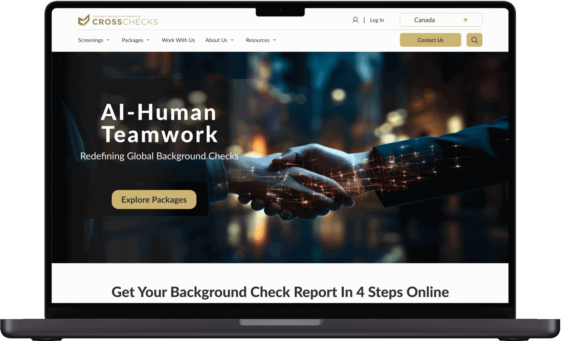
Neutral colors, varied font sizes, & refined CTA were introduced to create visual hierarchy
In order to create stronger visual hierarchy, I began by building a more comprehensive design system. While preserving brand consistency with the provided logo and font, I introduced font scales, weights, and neutral colors to enhance structure, readability, and used the brand color to refine CTAs.
As a foundation for the redesign, I conducted a full site audit to identify broken links, outdated pages, typos, and inconsistent terminology. Cleaning up these issues helped establish a more trustworthy and user-friendly experience."
Redesign Highlights
2. Simplified navigation & refined CTA
2. Varied font sizes were introduced to create visual hierarchy
Research shows users use dropdown menus for navigation and learning site features. I introduced dropdown navigation, a more prominent search bar, and a bolder CTA/hero to strengthen brand identity, improve accessibility, and simplify service discovery.
1. Content audit & consistency fixes
Research shows users use dropdown menus for navigation and learning site features. I introduced dropdown navigation, a more prominent search bar, and a bolder CTA/hero to strengthen brand identity, improve accessibility, and simplify service discovery.
BEFORE
AFTER
3. Eliminating distractions
I removed unnecessary distractions, animations, and irrelevant information. I also created concise package service cards that allow users to quickly find and understand the most essential information without going to another page.
BEFORE
AFTER
4. Service trust through testimonials
I incorporated prominent testimonials to build trust and confidence in unfamiliar services, addressing the industry’s reliance on user feedback for credibility. This strategy ensures potential customers can gain confidence through the positive experiences of other users.
ADDING TESTIMONIALS
5. Site-wide country switcher
I introduced a country switcher, allowing users from different regions to access location-specific services. While technical constraints prevented full implementation, filters provided a temporary solution.
AFTER
BEFORE
AFTER
BEFORE
How do users respond to the redesign?
Users appreciated the visual improvement but still need more service information
I conducted a comparative user evaluation with 5 participants by presenting the original and redesigned versions side by side. Users responded positively to the visual improvements but expressed a need for more information on services, such as pricing and process—details the client was still working to finalize.
5/5 users complete the “finding drug test screening” task within 6 sec, 9 times faster, compared to 20% abandonment rate.
✅
5/5 users think the visual design is improved with comfortable spacing and proper information hierarchy.
✅
5/5 users think it’s easier to navigate with a much more intuitive navigation, clear instructions, and a concise service overview.
✅
2/5 users think the new design still lacks enough information.
❌
Site-wide country switcher vs. filters: options for future adaptation
Technical Constraints
SITE-WIDE COUNTRY SWITCHER
After meeting with the stakeholder, I learned due to technical constraints, a site-wide switcher wasn’t feasible during the project, so the developer and I opted to implement filters on service pages as a temporary solution.
FILTER
Current Prototype

Final Thoughts
Post-implementation UX metrics recommendations
I recommended the following criteria for future iterations after design implementation:
Task completion time and rate: Track task completion rates and times for key actions, such as plan purchases and specific information searches, to identify potential navigation or clarity issues affecting user success.
Bounce rate: Track the percentage of users who leave the site after viewing only one page, which could signal confusion or irrelevant content.
User satisfaction scores: Collect user feedback through surveys or questionnaires to gauge overall satisfaction with the website experience.
Conversion rate: Measure the percentage of users who complete a desired action, such as signing up for a plan or making a purchase.
What I accomplished
Identified critical areas for improvement on the website including cluttered design, unclear information, inconsistent design elements, irrelevant content, and distracting animations to improve user navigation.
Revitalized brand visuals by transitioning from a traditional to a contemporary design, focusing on optimizing information hierarchy, enhancing spatial layout, and curating impactful imagery.
Optimized the website, resulting in a 9x faster task completion time and reducing the abandonment rate from 20% to 0% during the drug test navigation task (based on results from 5 users).
Improvement and Reflection
From this experience, I learned the importance of proactively identifying clients' unspoken needs. In this case, the client was still determining what services to offer, how to price them, and how to incorporate AI technology. I realized that gaining deeper industry knowledge early on is essential to understanding the barriers preventing them from reaching their goals. Leveraging tools like AI and competitor analysis earlier in the process would have helped clarify their positioning and strategy.
Moving forward, I aim to explore the ethical implications of AI in the background check industry to ensure its responsible use. I also recognize the importance of a more clearly defined business direction to support strategic decision-making. Balancing CROSS-CHECKS’ global expansion with a smooth transitional process remains a priority as I continue to refine workflows and support sustainable growth. I also hope to interview CROSS-CHECKS’ former users from the fingerprinting industry, as well as HR professionals from their target companies, to better understand their needs and challenges—and to support CROSS-CHECKS’ transition and help CROSS-CHECKS identify their niche.

<< Previous
Adding an AI-driven personalized stylist feature to ASOS e-commerce

Next >>
Effortless sustainable shopping: Responsive website + Chrome extension