9x Faster Task Completion: Redesigning a Background Check Site Navigation
Overview:
CROSSCHECKS, a global background check company, had major usability issues: abandonment rates were high and left users unable to find the services they needed, despite a booming $9B industry projected by 2030. Through research and optimization, I redesigned the site—cutting task time by 9x and reducing abandonment from 20% to 0%.


Tools
Figma, Procreate
Duration
Dec 2024 (4wks)
Project focus
Website redesign
My Role
UI/UX designer
"A background check isn’t just due diligence—it’s how we protect our people and our culture."
— Maria Chen, Senior HR Manager
Background

CROSSCHECKS expanded from local fingerprinting into global background checks but lost existing customers and struggled to convert new visitors into customers.
Global background check provider
Local fingerprint services
Problem
Users couldn’t find the services they wanted and often left before exploring further.
Solution
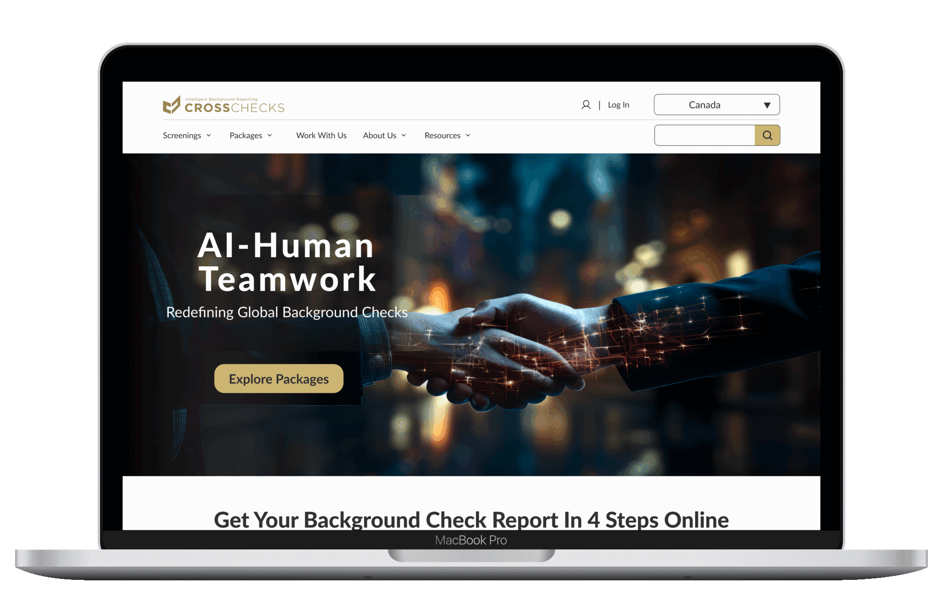
Homepage redesigned:
Improve services visibility
Make search bar more discoverable
Reduce cognitive overload
Impact

The redesign enabled users to complete tasks 9× faster.

15% conversion rate improvement.
User Groups & Needs
All three user groups see efficiency as key
Based on the initial discussions, I narrowed down to 3 types of users: small business owners, corporate HR teams, and individual employees. I conducted 5 user interviews and researched business articles and competitor background check reviews. I found that all groups view efficient navigation as key to their experience.
Small business owners
A quick, clear process to understand what background checks to request.
Human resource teams
Efficiency, scalability, and integration with existing hiring platforms.
Individual employees
Need to complete the required background check quickly to proceed.
Hidden services and disorganized content caused a 20% drop-off
Current Site Usability Analysis
Since this is for a global background check company, I recruited a diverse range of 5 participants from Canada, the UK, and the U.S. Moderated usability tests were conducted to learn:
Users’ site experience

Services finding strategy


Drug test service finding task completion time
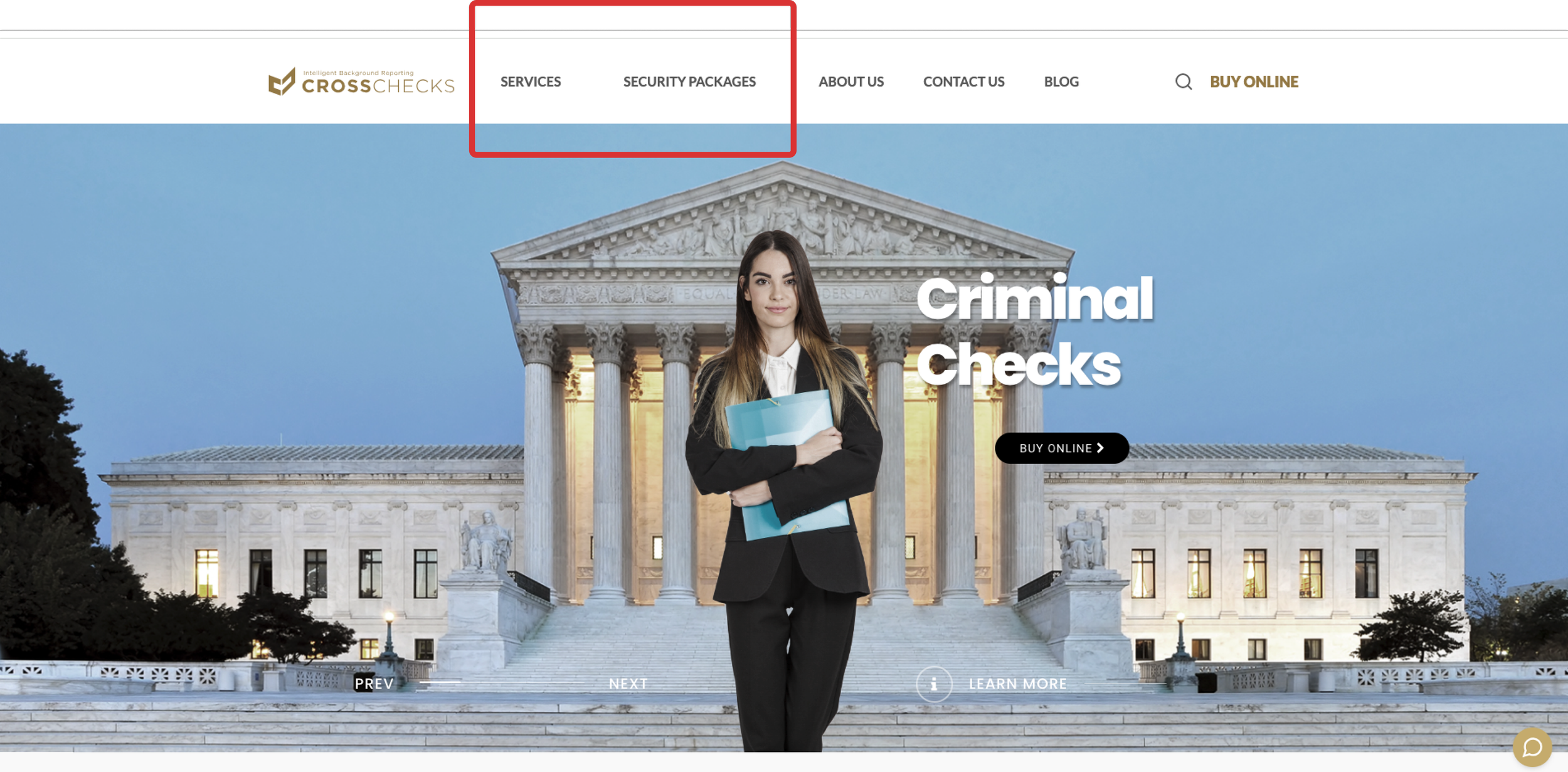
No dropdown to guide users to find desired services quickly
Users’ site experience:
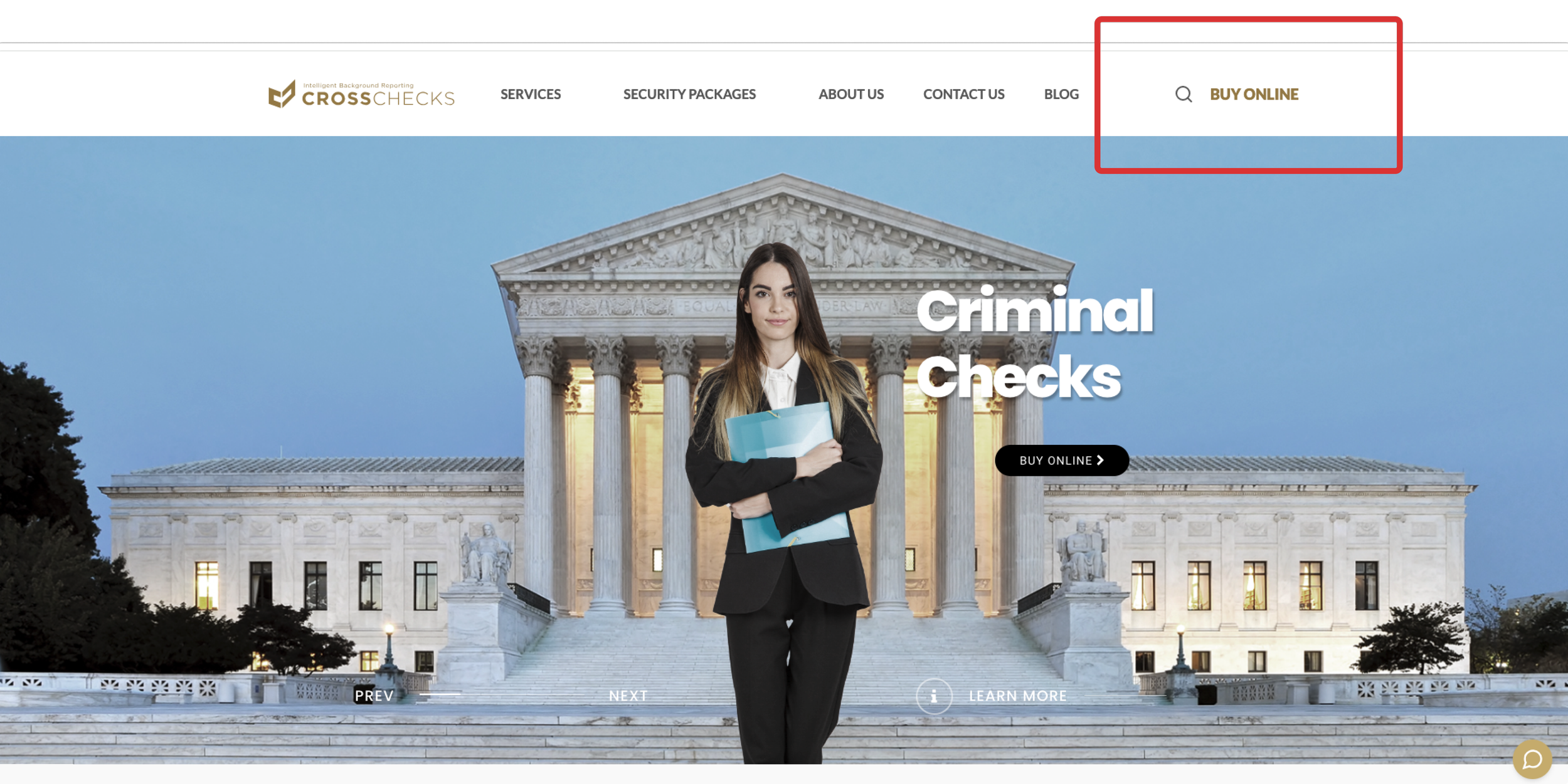
Search bar hard to notice
Excessive animations, cluttered and inconsistent copy, and hidden services hinder homepage scanning and service discovery, while outdated images reduce user trust.
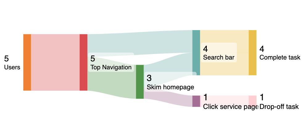
The Sankey diagram showing when tasked to locate the 'drug test service, all 5 users started with top navigation. When it failed, 2 used "search" and 3 skimmed the homepage; of those skimmers, 2 eventually looped to search while 1 abandoned the task frustratedly. .
5/5 users immediately used top navigation to find services and explore site structure
2/5 users used the search bar when navigation wasn’t enough
3/5 users skimmed the homepage to locate services when navigation wasn’t enough, with 2/5 users looping back to search to complete the task
1/5 users drop-off after entering an overwhelming service page at 5 minutes and 24 seconds
Drug test service finding task completion time:
Avg. 1 minute and 43 seconds completion; one drop-off at 5 minutes and 24 seconds.
All 5 users initiated their journey via the top navigation
User Service Discovery Strategy
Key insights
20%
Dropped off while finding services
😠
100%
Needed dropdown navigation to find services
😠
40%
Needed better search/ skimmability
⚠️
1’ 43”
Avg. service finding task completion time
😠
The benchmark usability testing shows users use dropdown menus for finding services they want and learning site features. If they can’t find dropdown menus they became annoyed immediately. I introduced structured dropdown menus featuring service grouping and alphabetical ordering to significantly improve service discoverability.
1. Adding dropdown menus
Redesign Highlights
BEFORE (no dropdown menus)
AFTER (with dropdown menus)
2. Improved search bar discoverability
I improved search visibility by applying a distinct CTA color to the search action and removing the competing 'Buy Now' button, to focus users on a single, intentional discovery path.
BEFORE (inconspicuous search bar)
AFTER (more prominent search bar)
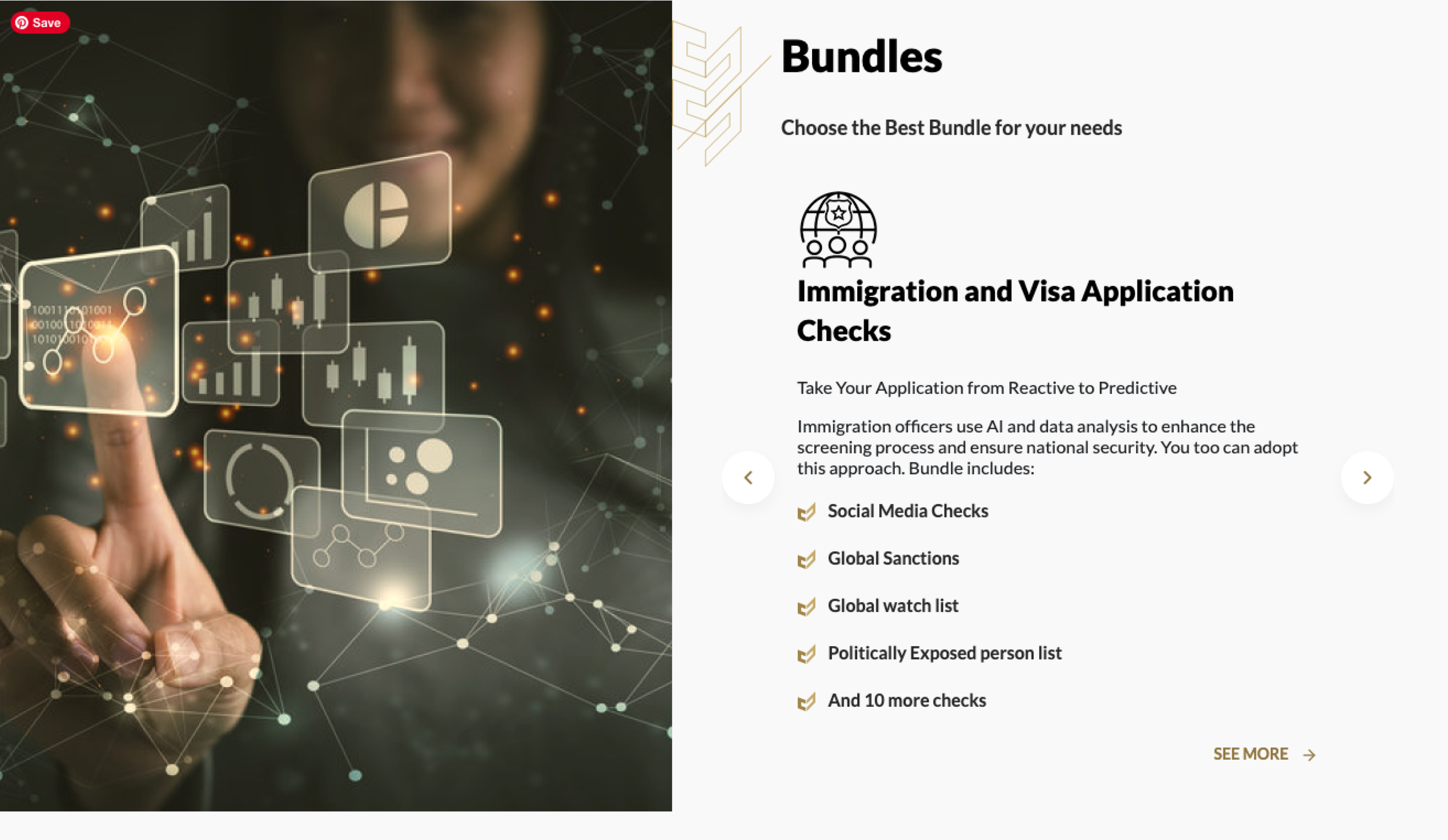
3. Easier service discovery with clear, static service listings
I removed distracting visuals and autoplay carousel to create a calmer browsing experience. Listed each test clearly on the same page so users can explore service packages at their own pace without navigating to separate pages.
BEFORE (autoplay carousel)
AFTER (user-controlled carousel)
100% users found services wanted seamlessly. They then identified a need for more detailed content.
Second Usability Test
I conducted a comparative evaluation with 5 participants from the U.S. and Canada. Once users could easily locate services, they expressed a critical need for more granular details—such as pricing, process steps, and a country switcher—which the client was still finalizing.
Updated site navigation efficiency

Updated site user experience

The following key findings were identified during the interviews:
All 5 users completed the “finding drug test screening” task in an average of 11 seconds, compared to 20% abandonment rate.
All 5 users found it’s easier to navigate with a much more intuitive navigation, progressive disclosure, improved visual and content hierarchy.
2/5 users found the new design still lacks enough information.
Test Result
😊
9x faster
Task was completed faster after the redesign
11”
Avg. service finding task completion time
😊
20% → 0%
Abandonment rate after the redesign
😊
40%
Found important details were unclear
😠
More Iterations
1. Creating process overview and templates with limited information
After the second usability test, I learned that 2 out of 5 users noticed that some services were country-specific but not clearly labeled, some in titles, others in subheaders, making them feel confused and less confident in the site.
Process overview
Template with process details and “Contact Us”
After the second usability test, I found that users wanted clearer details on pricing and turnaround time before booking. Since these elements were still being defined, I collaborated with the CEO to design a service template based on competitor analysis, adding key information, clear instructions, and a prominent “Contact Us” option for user inquiries.
2. Adding whole site country switcher
BEFORE (inconsistent country labeling)
AFTER (site-wide country switcher)
Technical Constraints & Adaptation Strategies
Filters as the current solution vs. site-wide country switcher for future adaptation
After meeting with the stakeholder, I learned that a site-wide region switcher wasn’t feasible on the WordPress platform due to technical constraints, so the developer and I implemented service page filters as a temporary solution.
Site-wide country switcher
Service page filter
Current Prototype

Client Testimonial

Eliza M. CEO of CROSSCHECKS
“Her thoughtful approach—asking the right questions and doing deep research to truly understand my business—resulted in a website design that exceeded my expectations.”
Final Thoughts
Post-implementation UX metrics recommendations
I recommended the following metrics to guide future iterations after design implementation:
Task completion time and rate: Track task completion rates and times for key actions, such as plan purchases and specific information searches, to identify potential navigation or clarity issues affecting user success.
Bounce rate: Track the percentage of users who leave the site after viewing only 1 page, which could signal confusion or irrelevant content.
User satisfaction scores: Collect user feedback through surveys or questionnaires to gauge overall satisfaction with the website experience.
Conversion rate: Measure the percentage of users who complete a desired action, such as signing up for a plan or making a purchase.
What I accomplished
Identified critical areas for improvement on the website including cluttered design, unclear information, inconsistent design elements, irrelevant content, and distracting animations to improve user navigation.
Revitalized brand visuals by transitioning from a traditional to a contemporary design, focusing on optimizing information hierarchy, enhancing spatial layout, and curating impactful imagery.
Optimized the website, resulting in a 9x faster task completion time and reducing the abandonment rate from 20% to 0% during the drug test navigation task (based on results from 5 users).
Improvement and reflection
The unspoken client needs, often the root of deeper challenges:
From this experience, I learned the importance of proactively identifying clients' unspoken needs—often the root of deeper challenges. What initially seemed like a visual design issue turned out to reflect a lack of clarity in the client’s business identity. When clients struggle to define content hierarchy and priorities, in this case, it signals unresolved questions about their core services, pricing, and positioning. I realized that gaining deeper industry knowledge early on is essential to understanding the barriers preventing them from reaching their goals. Addressing these issues requires going beyond UI fixes—leveraging tools like AI and competitor analysis earlier in the process could have clarified their direction and strengthened strategic decisions.
Explore more the ethical implications of AI in the background check industry:
Moving forward, I aim to explore the ethical implications of AI in the background check industry to ensure its responsible use. I also recognize the importance of a more clearly defined business direction to support strategic decision-making. Balancing CROSSCHECKS’ global expansion with a smooth transitional process remains a priority as I continue to refine workflows and support sustainable growth.

<< Previous
Adding an AI-driven personalized stylist feature to ASOS e-commerce

Next >>
Effortless sustainable shopping: Responsive website + Chrome extension