
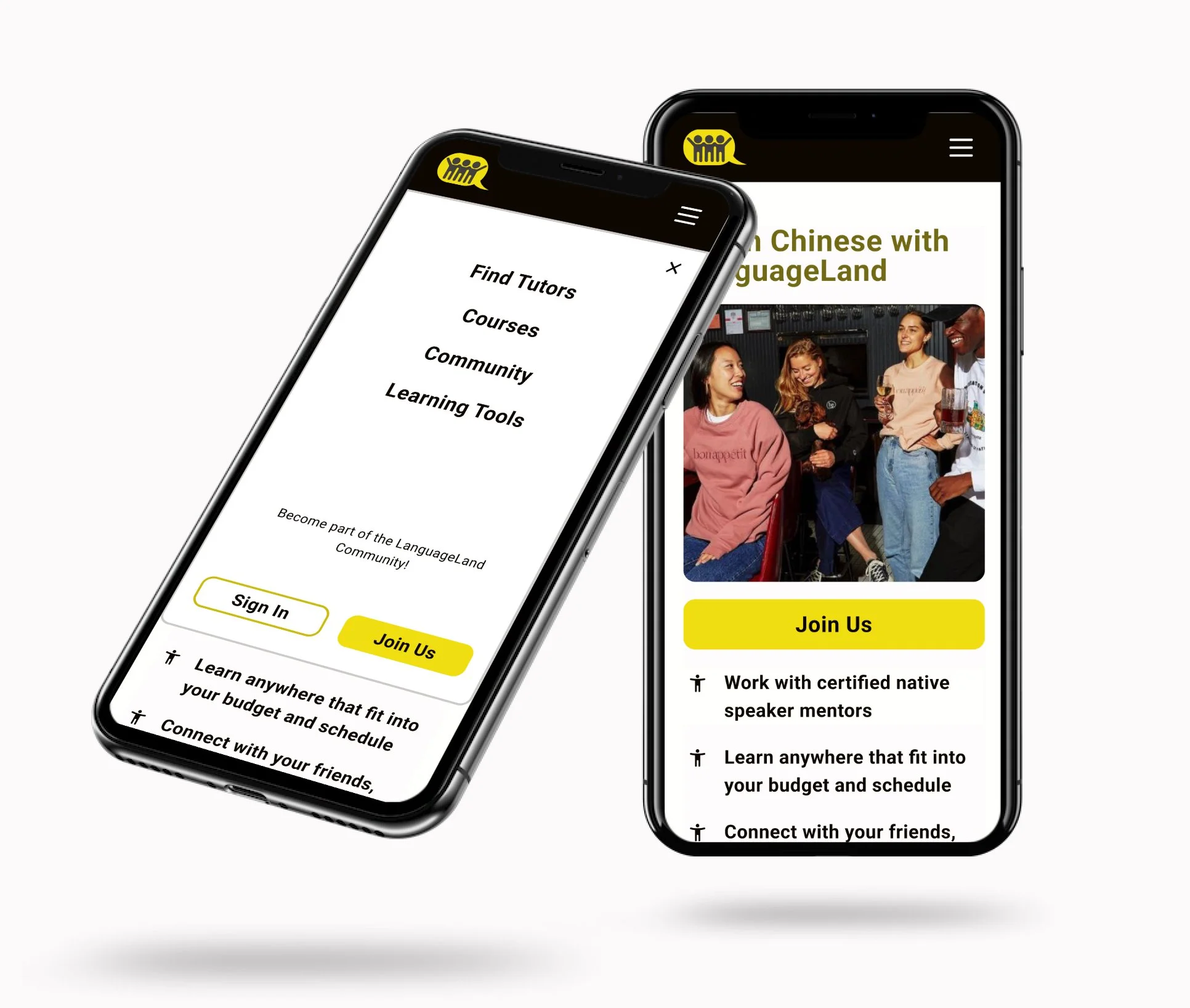
LanguageLand: Connecting Users with Native Speaker Mentors
This case study highlights my inaugural UX/UI design project, a mobile-first Chinese learning site that has the potential to expand to a multiple-language learning site. I independently developed it as part of the Design Lab boot camp course. As an immigrant, I have personally witnessed the transformative power of language in fostering cross-cultural connections and global understanding. Motivated by my experiences, I am dedicated to designing a long-lasting and user-friendly language-learning website that enables individuals to be motivated to learn, communicate effectively, build meaningful relationships, and promote a more interconnected world.

Methods
Interviews,
Moderated usability testing
Tools
Figma/FigJam, Google form
My Role
Solo UX/UI designer
Duration
Feb 2024 - May 2024 (3 weeks)
Language learners struggle with finding native speakers, engaging with realistic materials, getting feedback, and learning alone. However, most of the currents services and products on the market now only provide limited features.
Problem
A language learning site features 1-1 native speaker mentors, standardized course material, and language-pals features.
Solution
How can we help the learners keep feeling motivated throughout the language learning process?
Research
To gain a comprehensive understanding of the language-learning site, we employed various initial research methods. Our approach included conducting surveys, moderated interviews, affinity mapping, competitive analyses, “How Might We” exercise, and divergent thinking practice, to identify existing challenges and solutions within the industry. We surveyed 18 people and interviewed 6 language learners out of the survey to understand their joys, common learning habits, pain points, and struggles with motivation and practice.
Primary Research
Our users desire feedbacks, native speakers, and friends to learn together
I interviewed 6 out of the 18 survey participants, and conducted interviews to learn the following objectives and synthesized the key insights through Affinity Map.
How do the new language learners learn a new language?
What do the learners enjoy and frustrate during the learning process?
Habits and goals for learning a new language?
Affinity map was performed to synthesize key insights. This partial view shows how I got the insights. Click the link for the full report and the image to enlarge.
Key Insights

Diverse body types and skin tones of models needed

Outfits recommendations for different situations needed
I then began exploring existing eco-shopping platforms. Four major platforms were identified through forums, online research, interviews, and AI tools. My goal was to uncover successful strategies, spot market gaps, recognize shopper behavior patterns, and understand the factors that influence eco-friendly shopping habits.
Competitive Analysis
-
Earthy theme
Wide range of products
With a wealth of eco-friendly resources
Chrome extension design
-
A cleaner user interface
Address browser compatibility for broader accessibility
Incorporate more visual elements for user engagement
-
Beauty & personal care, babycare, clothing & accessories, health, groceries, pet supplies, toys & games, electronics
-
Chrome extension
Blog
Eco-Rating
-
Relatively contemporary website design
Wide range of products
Accessible through popular platforms like Target/ Amazon
-
Expand product selection for wider audience appeal
Expand zero-waste alternatives across product lines to maximize impact
-
Home decor, food & drink, women, beauty & wellness, jewelry, paper & novelty, kids & baby, pets, men
-
Blog
-
Earthy theme
Subscription based business model
Subscribe and save incentive program
Live chat support
-
Provide more various of products
Modernize & streamline the website design
Provide a stronger incentive program
-
Home & kitchen, cleaning, bathroom, beauty, baby & kids, pets
-
c
-
Earthy theme
Cluttered website layout design
Limited household item offered while no grocery
-
Digeestable eco-friendly information
Streamline certification for small businesses
Modernize website design
Include engaging multimedia content
-
infection control, cleaning, catering, first aid, etc
-
No specific educational resources on their website
Business opportunities:
These eco-friendly brands emphasize natural and earthy aesthetics.
Most brands prioritize informal education materials in blogs, but scientific evidence is needed.
Most brands only offer limited household items categories without groceries.
I conducted another competitive analysis of popular marketplace websites to identify where the eco-friendly shopping experience falls short. Leveraging AI tools, online forums, I identified the four most widely used platforms for groceries and household items.
Primary Research
Despite eco-consciousness, shoppers need sustainable info, convenience, health benefits, and affordability to follow through
To identify how to boost eco-friendly shopping despite the abundance of marketplaces, I conducted a survey (11 participants) & interviewed 5 household shoppers (2 singles, 3 with families), aligned with VISA's user demographics for representative insights.
Eco-awareness across the target audiences

Usual shopping routines

What drives / hinders eco-shopping

Shoppers’ Pain Points

Knowledge gap
Shoppers unaware of product impact, struggle to verify eco-friendly options

Price concern
Eco-friendly products are often pricier

Convenience
Shoppers avoid multiple marketplaces or actively seek eco-friendly products

Health benefits
Shoppers prioritize personal health benefits > global impact
Affinity map was performed to synthesize key insights. This partial view shows how I got the insights. Click the link for the full report and the image to enlarge.
-
Earthy theme
Wide range of products
With a wealth of eco-friendly resources
Chrome extension design
-
A cleaner user interface
Address browser compatibility for broader accessibility
Incorporate more visual elements for user engagement
-
Beauty & personal care, babycare, clothing & accessories, health, groceries, pet supplies, toys & games, electronics
-
Chrome extension
Blog
Eco-Rating
-
Earthy theme
Subscription based business model
Subscribe and save incentive program
Live chat support
-
Provide more various of products
Modernize & streamline the website design
Provide a stronger incentive program
-
Home & kitchen, cleaning, bathroom, beauty, baby & kids, pets
-
c
-
Earthy theme
Cluttered website layout design
Limited household item offered while no grocery
-
Digeestable eco-friendly information
Streamline certification for small businesses
Modernize website design
Include engaging multimedia content
-
infection control, cleaning, catering, first aid, etc
-
No specific educational resources on their website
-
Relatively contemporary website design
Wide range of products
Accessible through popular platforms like Target/ Amazon
-
Expand product selection for wider audience appeal
Expand zero-waste alternatives across product lines to maximize impact
-
Home decor, food & drink, women, beauty & wellness, jewelry, paper & novelty, kids & baby, pets, men
-
Blog
Business opportunities:
TBE
I identified two distinct groups, from interview and survey, and created personas to keep their traits and needs in mind throughout my design process: 1. Fashion enthusiasts value meticulous style details. 2. Busy professionals seek personal style development amidst time constraints.
Our Target Customers
“ How might we help online shoppers visualize outfit fit and receive personalized recommendations without being in-store? “
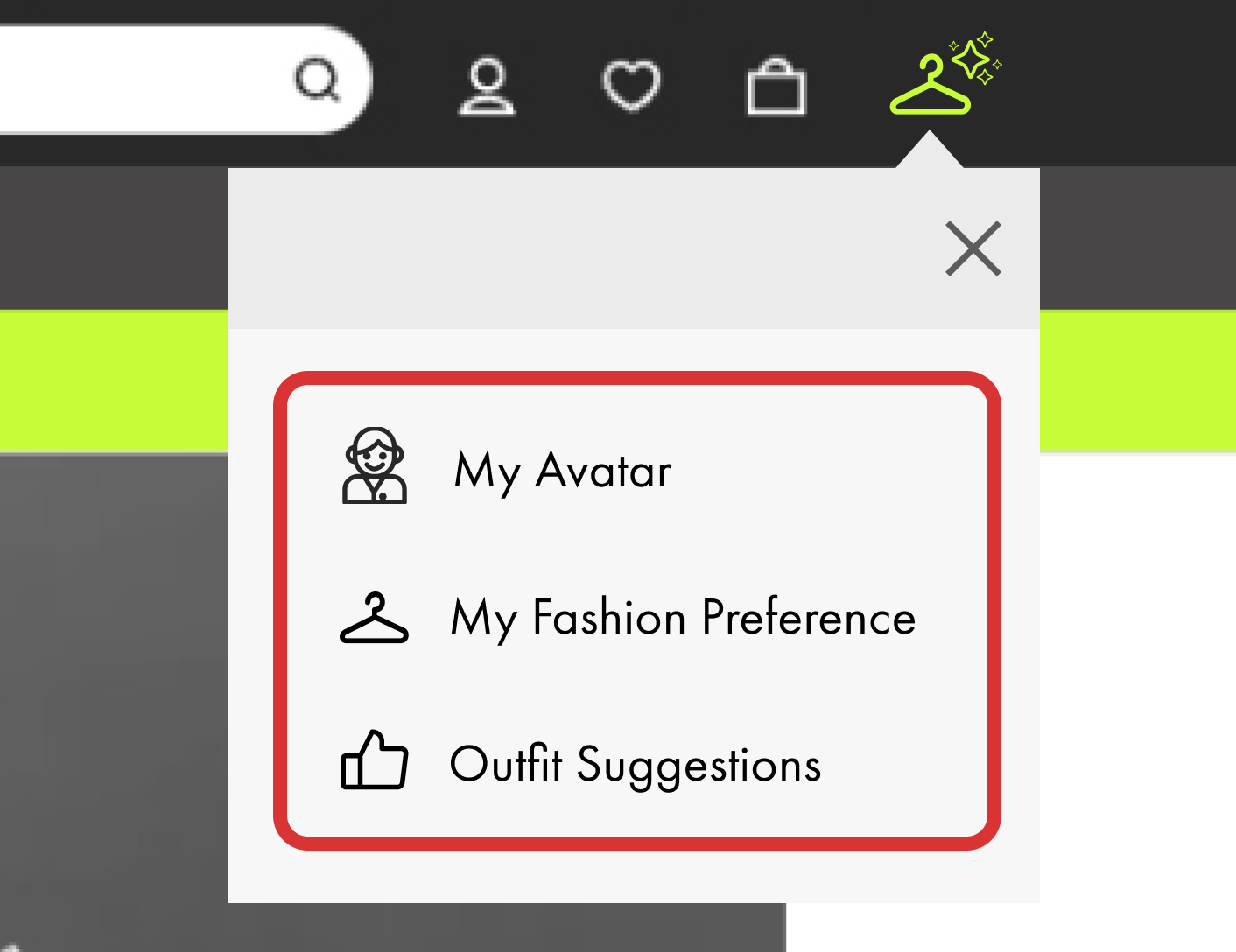
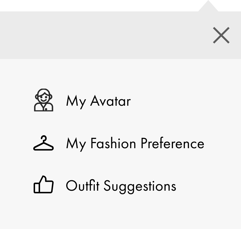
Laying the groundwork: from avatar setup to personalized outfit suggestions
User Flows
Armed with these insights, I set out to design an AI Stylist onboarding flow that tackled these challenges directly while making the process engaging, user-friendly, and efficient. Through a conversational quiz, I balanced guidance and flexibility while gathering key details such as body measurements, skin tone, and style preferences. I included:
Designing a flow that balances conversational with traditional onboarding process to gather necessary information.
“Skip” and “Surprise me” options to prevent fatigue.
Visual aids to help users choose styles.
AI stylist outfit suggestion task flow
Click the image to see the full-size image.
Mid-Fidelity Wireframes
Building on the onboarding flow, I sketched low- and mid-fidelity wireframes to explore layout options, visual hierarchy, and placement. I also used this opportunity to evaluate whether the feature would work better as a modal or a standalone page within ASOS. Since the function is meant to enhance the traditional product page, I ultimately chose a modal design.
Mid-fidelity wireframes

Click the image to see the full-size image.
Following ASOS Design System
I adapted to the existing design system by observing visual and interactive patterns across the platform. Using the Chrome extensions to inspect font colors, styles, states, and behaviors, I reverse-engineered and improved key elements to ensure consistency. Based on these insights, I designed new components—including modals, modal product cards, and interactive states.
Existing UI
1. ASOS dropdown informing new designs through existing elevation and visual style
2. Homepage secondary color informs improved CTA design
ASOS’s original CTA lacked a hover state and didn’t stand out visually. I preserved the shape but enhanced visibility by applying the homepage’s secondary color.
3. Existing profile detail page informs state design
Inspired by the state used on ASOS’s profile detail page, I applied a similar approach to define interaction and selection states in my modal design.
4. ASOS original product card inspired modal card design
Inspired by the activated state used in ASOS’s profile setup, I applied similar interaction cues to enhance the product card design.
Adapted Design
1st Usability Test
Shoppers needed an even more flexible, shorter, and guided onboarding process
Once I had a working solution, I tested it with users to evaluate the visual and functional experience of the onboarding process—and understand the perceived value of this feature within the website—I conducted moderated usability tests with 5 users via Zoom. The key findings are:
AI stylist icon on the ASOS site:
All 5 users highly valued AI stylist feature.
Average icon search time was 5 seconds, suggesting good visibility.
AI stylist onboarding process:
Average total onboarding completion was 5 minutes 52 seconds, but 1 - 3 minutes is common for smooth experiences, based on NNG.
4/5 users found intent-driven question for body type queries confusing.
All 5 users needed an even more flexible onboarding process, allowing skip without losing provided information.
The average satisfaction score was 7 out of 10, with 10 being the most satisfied.
Key Insights
I organized the findings using an affinity map to uncover patterns in user feedback. These insights highlighted key areas for improvement in the onboarding experience and informed the following design priorities:

Flexible process
Users require even more pre-built databases & skippable steps

Shorter process
Users need shorter onboarding process

Guided process
Guided onboarding is favored over intent-driven ones
Iteration
1. More streamlined flow options
Initially, I thought key questions couldn't be skipped. However, I realized I needed to be more empathetic, finding ways to reduce the user's load while still collecting the necessary information.
BEFORE
AFTER
2. Break one long onboarding process down to three shorter tasks
I broke the AI stylist flow into two separate tasks: 1. Onboarding: "My Avatar" and "My Fashion Preferences" and 2."Outfit Suggestions". Now, users can save and edit their information and preferences at any time, giving them more flexibility to return and make adjustments as needed.
BEFORE

AFTER
3. Change from “open-ended questions” to “guided body type questions”
During the usability test, I found that users felt more comfortable with guided questions, as they wanted the avatar to be accurately built. They felt lost with open-ended questions and were unsure how to provide accurate information without guidance.
BEFORE: ONE OPEN-ENDED QUESTION

AFTER: MULTIPLE GUIDED QUESTIONS


2nd Usability Test
After the iteration, I wanted to assess whether the updates reduced onboarding time and minimized user overwhelm. I conducted moderated usability sessions using the Rapid Iterative Testing and Evaluation (RITE) method, allowing me to quickly evaluate the iteration results and make further changes based on feedbacks from a smaller group of users (3 participants).
To evaluate the improvements, I measured task completion time, satisfaction score for the new flows. I also ran A/B tests on:
Open-ended vs. guided body type questions
1 long outfit suggestion flow vs. 3 shorter flows: 2 onboarding and 1 outfit suggestion

Measure task completion time and satisfaction score

A/B testing confirms user preference
After the testing, the following key findings were identified:
The average task completion time was 5 minutes and 4 seconds, compared to 5 minutes 52 seconds.
The overall satisfaction score improved significantly, rising from 7.0 to 9.3.
All 3 users still preferred guided questions over open-ended ones.
1/3 user preferred a single onboarding flow, citing sufficient flexibility and confusion about where to start when the process was broken into separate steps.
Key Insights
Breaking the flow into smaller, guided steps with more skippable options and preset databases significantly improved both efficiency and user experience, overall satisfaction increased by 32.9%. These iterations reduced cognitive overload, but also introduced some confusion about where to start, highlighting the need to further refine guidance to sustain and enhance user satisfaction.


More Iteration
Managing entry point clarity through visual cues
Splitting a single flow into three dropdown steps slightly confused 1 user. To improve guidance and reduce friction, I introduced visual cues that clarified progression and helped users stay oriented.
BEFORE
AFTER

Final key screens
Personalized avatar creation for virtual try-on
Basic body measurements
Basic body shape
Avatar building with tailored skin tone
Avatar body shape fine-tune
AI stylist powered by fashion quiz for personalized outfit recommendation
Style keyword quiz with image support
Outfit upload for style preference building
Refine style preferences
Indicate the outfit's occasion and purpose
Suggested outfit with expandable item details and more options
Result display

Prototype
Final Thoughts
What I accomplished
I designed an AI Stylist feature for ASOS, enabling personalized avatars for virtual try-on and AI-powered outfit suggestions.
This feature was designed to resolve online shoppers’ challenges in matching outfits to their body types, skin tones, unique fashion styles, and occasions.
A seamless onboarding process balances AI intelligent adaptability and user guidance. It offers flexible image options, text-image explanations, auto-saving steps, and manageable tasks while gathering sufficient information.
Next Steps and Reflection
Balancing conversational inputs and traditional questionnaires:
Reflecting on my ASOS AI stylist project, I recognized the importance of guiding users through the onboarding process to ensure their comfort and trust in the platform's accuracy. Key lessons learned included avoiding standalone open-ended questions when integrating AI functionality, the effectiveness of a text-image questionnaire over text-only or image-only options, and the value of combining multiple-choice and open-ended questions. This approach offered clearer guidance for users while encouraging them to express their unique needs and preferences.
Ethical artificial intelligence insights in style tech:
Simultaneously, I acknowledged the pressing need to delve into AI ethics within the fashion world. By promoting ethical integration and usage of AI technology, I sought to contribute positively to the industry and foster responsible innovation. Enhancing avatar accuracy and harnessing the swap function for feedback-driven outfit suggestions also became crucial components of my vision to blend technology and ethics harmoniously.
Adding delightful, user-centric functionalities:
Looking ahead, I’m eager to expand the AI stylist’s capabilities based on insights from competitor research and user interviews. I see potential in integrating the AI stylist with a user’s calendar to provide outfit suggestions for specific events, while also offering a closet management system to help users visualize and organize their wardrobe. These features aim to reduce decision fatigue and make the AI stylist a truly personalized, proactive companion in users’ daily lives—enhancing not just style, but also confidence and convenience.
Modal design and technical constrains:
Modal design is technically complex due to scroll handling, layering issues, and mobile constraints. I learned the importance of understanding engineering limitations early in the design process. While modal dialogs are sometimes seen as interruptions, I leveraged their ability to appear on top of a page—without requiring navigation—to present content intentionally before users enter the main shopping flow. This approach aligns with NN/g’s guideline that modals are appropriate when they support critical decisions or help prevent costly mistakes. By offering personalized outfit suggestions upfront, the modal enables more confident choices and helps reduce return rates by aligning options with users’ unique needs from the start.
How I would measure the impact
Return Rate Reduction: Track changes in product return rates before and after users engage with the AI Stylist to evaluate its effectiveness in improving fit and satisfaction.
User Satisfaction Score: Collect satisfaction ratings post-stylist usage through in-app prompts or email follow-ups to gauge perceived helpfulness and user experience quality.
Qualitative Feedback Collection: Use short feedback forms or contextual surveys to capture insights on how well the stylist matched user preferences, and identify areas for refinement.

<< Previous
Effortless sustainable shopping: Responsive website + Chrome extension

Next >>
Redesigning a Background Check Website for Faster Task Completion