

Transform Opaque User Experience in Background Check

Summary
With 95% of employers conducting background checks, the global market is projected to grow to $9 billion by 2030. As CROSS-CHECKS expanded from a local fingerprinting service to a global background check provider, it faced navigation issues due to industry-wide UX/UI design shortcomings and its business transition. Through research and optimization, I improved the website, achieving 9x faster task completion time and reduced abandon rate from 20% to 0%.
My Roles
UX/UI designer
Tools
Figma, Procreate
Client Industry
Background check
Duration
Sep 2024 (4wks)
Project Focus
Website redesign
My Responsibility
- User interview and usability testing
- Developed content and visual hierarchies for home and service pages based on user needs and business goals / constrains
Problems
Users had difficulty finding the background check services they needed
As CROSS-CHECKS shifts from a Canadian fingerprint service to a global background check provider, it faces obstacles in website navigation. Cluttered design, unclear information, broken links, inconsistent design elements, typos, irrelevant content, and distracting animations collectively hinder user experience.
Irrelevant information

Cluttered design
Unclear business identity

Enhanced content hierarchy, providing intuitive navigation clues, & clear instructions
Solution
Prioritized information with both business goal and user need

Eliminated distractions and created concise package service cards
Introduced intuitive navigation clues backup by research with color, spacing, typography, and psychology
Client Testimonial
The client expressed overwhelming satisfaction upon reviewing the proposal & delivered work

Eliza M. CEO of CROSS-CHECKS
“Her thoughtful approach, asking the right questions, and doing deep research to truly understand my business, resulted in a website design that exceeded my expectations.“
What Do Our Competitors Do?
Conducted competitor analysis & AI research to identify effective website organizing strategies
Leveraging research and client insights, I identified key global background check companies and conducted a competitive analysis. My goal was to understand their business structures, service offerings, and information organization strategies to inform CROSS-CHECKS' transition to a global provider.

I aim to learn:


Pros and cons of their websites structure?
What kind of services do they offer?
Key findings:


Lack of transparency
Industry-wide issues include lack of transparency and disorganized content, affecting user experience and trust.
Inconsistent array of services
Different companies offer an inconsistent array of services, each structured differently, resulting in significant variations among providers.
Testimonials needed
Global background check websites commonly employ testimonial sections to bolster user trust.
Who are our users?
Small businesses owners & busy corporate HR
By combine user interview and ChatGPT, I was able to create detailed personas which informed my design decisions: intuitive and efficient are keys.
Audit and Usability Test
Hidden services & disorganized content resulted in a 20% user navigation task abandonment rate
Moderated tests confirmed audit findings, revealing that navigation challenges led to user frustration. Lack of prominence on search function also hindered others from discovering it, causing some participants to abandon their tasks when asked to complete “drug test” navigation.
I aim to learn:

Task completion time?

Current site feedback?

Navigation strategies?
Who are our participants?
2 occasional users
3 naive users
from Canada, UK, and U.S
Moderated usability test in progress
Key findings:
Users rely on navigation menu for easy access to desired services and understand site functionality.

Users typically give up after 180 sec, with an average task completion time of 103 sec.
Users felt overwhelmed by cluttered content, irrelevant information, and excessive animations.
Next Steps:
Introduced navigation dropdowns
Eliminated distractions
Redesigned homepage, featuring service overview and establish user trust for unfamiliar services
Added site-wide navigation for different countries
UI Kit Design
Built upon existing brand design by adding elements that refine content hierarchy & highlight CTAs
Maintain brand consistency and cater to user preferences, I preserved and refined the original brand standards.
Enhance content hierarchy and improve readability, I incorporated additional font sizes, weights, and neutral colors, ensuring a visually appealing and easily navigable experience.
Re-design Updates
To enhance user experience, I've introduced dropdown navigation, as users prefer this method for finding desired items and learn the site functionality. This user-centric layout improves accessibility and efficiency locating services.
1. Introduced navigation dropdowns
Before
No dropdowns
After
With dropdowns
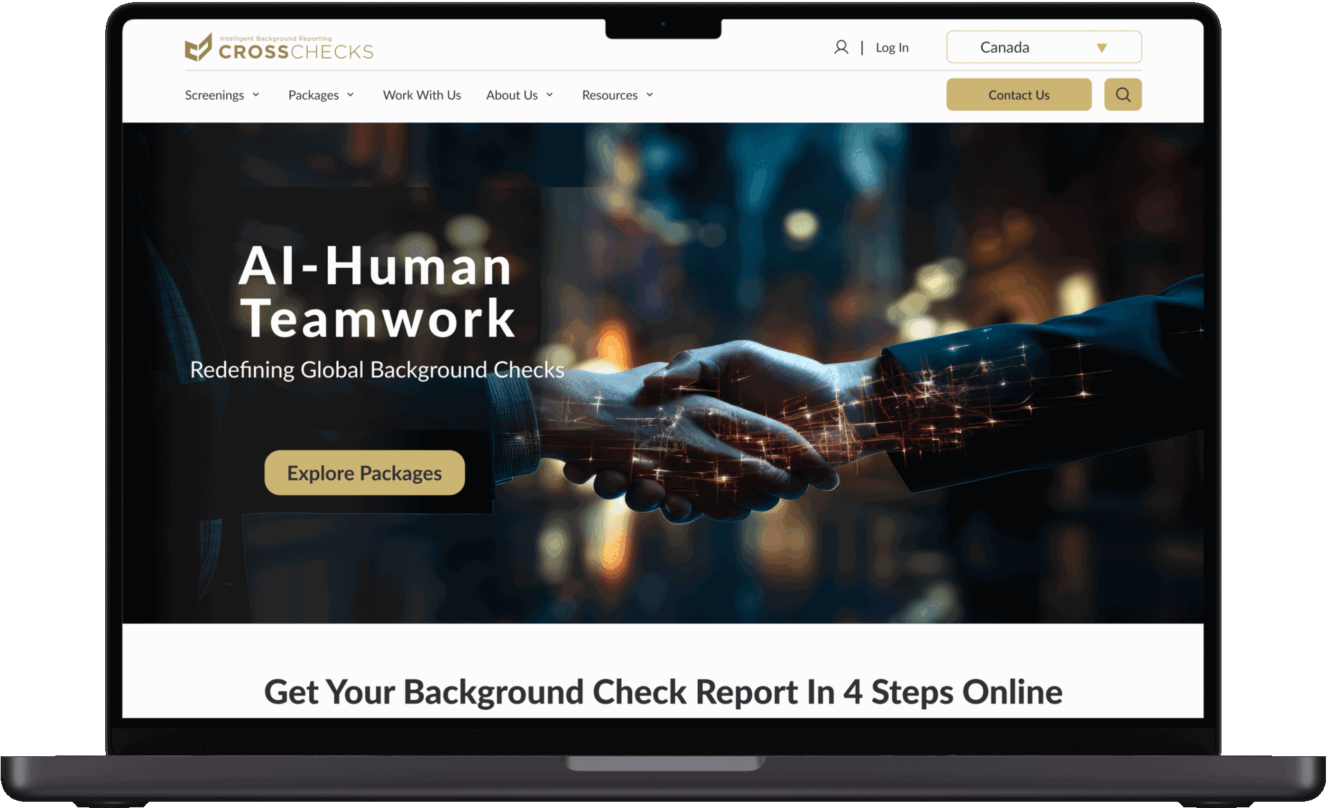
In order to foster user trust and confidence for unfamiliar services, I redesigned the homepage featuring a service overview, followed by prominent testimonials. This strategy ensures potential customers can efficiently explore the services and gain confidence through the positive experiences of other users.
2. Eliminated distractions
Loads of texts with carousel animation
Before
Clean product cards design
After
To optimize content hierarchy, I removed unnecessary distractions, animations, and irrelevant information, which were found to be distracting during usability testing. I also created concise package service cards that allow users to quickly find and understand the most essential information without going to another page.
3. Redesigned homepage, featuring service overview and establish user trust for unfamiliar services
Clutter design, excessive animation, without information hierarchy
Before
More prominent search bar
After
Use bolder CTA and hero session
Start with process overview
Screening services overview
Package services overview
End with testimonials
4. Added site-wide navigation for different countries
Site-wide navigation for various countries enhances user experience by enabling quick access to global information based on location-specific needs.
Before
Site-wide navigation
After
Usability Test After Redesign
Comparative User Evaluation: Original vs Redesigned Website
To assess the impact of the redesign, I conducted a comparative user evaluation involving five unique users. By measuring task completion times and gathering feedback on website design and navigation, I gauged the effectiveness of the implemented changes and identified any remaining areas for improvement.
5/5 of users complete the “finding drug test screening” task within 6 sec, 9 times faster, compared to 20% abandon rate.
5/5 of users think the visual design is improved with comfortable spacing and proper information hierarchy.
5/5 user think it’s easier to navigate with a much more intuitive navigation, clear instructions, and a concise service overview.
1/5 of the users think the new design still lack of enough information and a clear CTA.
Prototype

Post-implementation UX metrics recommendations
Here are some criteria I recommended the client considers for future iterations after design implementation.
Task completion time and rate: Track task completion rates and times for key actions, such as plan purchases and specific information searches, to identify potential navigation or clarity issues affecting user success.

Bounce rate: Track the percentage of users who leave the site after viewing only one page, which could signal confusion or irrelevant content.
User satisfaction scores: Collect user feedback through surveys or questionnaires to gauge overall satisfaction with the website experience.
Conversion rate: Measure the percentage of users who complete a desired action, such as signing up for a plan or making a purchase.

Identified critical areas for improvement on the website including cluttered design, unclear information, inconsistent design elements, irrelevant content, and distracting animations to improve user navigation.
What I accomplished
Revitalized brand visuals by transitioning from a traditional to a contemporary design, focusing on optimizing information hierarchy, enhancing spatial layout, and curating impactful imagery.
Optimized the website resulting in a 900% faster, reduced abandon rate from 20% to 0% during drug test navigation task completion.
From this experience, I learned the importance of proactively identifying clients' unspoken needs and leveraging tools like AI and competitor analysis to gain a deeper understanding of their industry standing earlier in the process. Moving forward, I aim to explore the ethical implications of AI and its integration into the background check industry, focusing on ensuring the responsible and ethical use of technology. Additionally, I recognize the need for clearer primary calls-to-action (CTAs) and a more defined business direction to enhance strategic decision-making. Balancing CROSS-CHECKS' global expansion with a seamless transition remains a priority as I continue refining processes and fostering sustainable growth.
Improvement and Reflection

<< Previous
AI-driven personalized avatar & stylist clothing shopping

Next >>
Effortless sustainable shopping: Website + Chrome extension