
Revolutionizing User Experience in the traditional Background Check Industry
Client Name
CROSS-CHECKS' business transition and unintuitive design resulted in navigation challenges for users

CROSS-CHECKS

Irrelevant information
Cluttered design
Uncleared business identity
5 usability tests in total
A global background check provider, faced navigation issues. I optimized the website resulting in a 900% faster task completion, reduced abandon rate from 20% to 0%.
My Roles
Solo UX/UI designer & web optimization consultant
Tools
Figma & moderated usability test
Duration
TL;DR
Sep 2024 (3 weeks)
Identify Problems
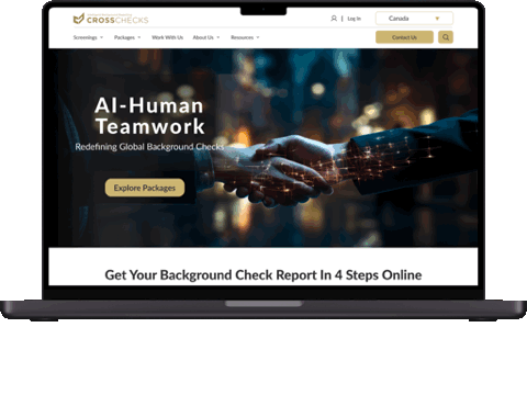
As CROSS-CHECKS shifts from a Canadian fingerprint service to a global background check provider, it faces obstacles in website navigation. Cluttered design, unclear information, broken links, inconsistent design elements, typos, irrelevant content, ambiguous business identity, and distracting animations collectively hinder user experience and navigation on the website.

Prioritized information with both business goal and user need
Eliminated distractions and created concise package service cards
2. Eliminated distractions and created concise package service cards
To ensure a more pleasant user experience, I've removed unnecessary distractions, such as animations and irrelevant information, which were found to be annoying during usability testing. Additionally, I created concise package service cards that allow users to quickly find and understand the most essential information without going to another page.
100% of users complete the “finding drug test screening” task within 6 sec, 900% faster, compared to 20% abandon rate
100% of users think the visual design is improved with comfortable spacing and proper information hierarchy
After: Clean design with service card

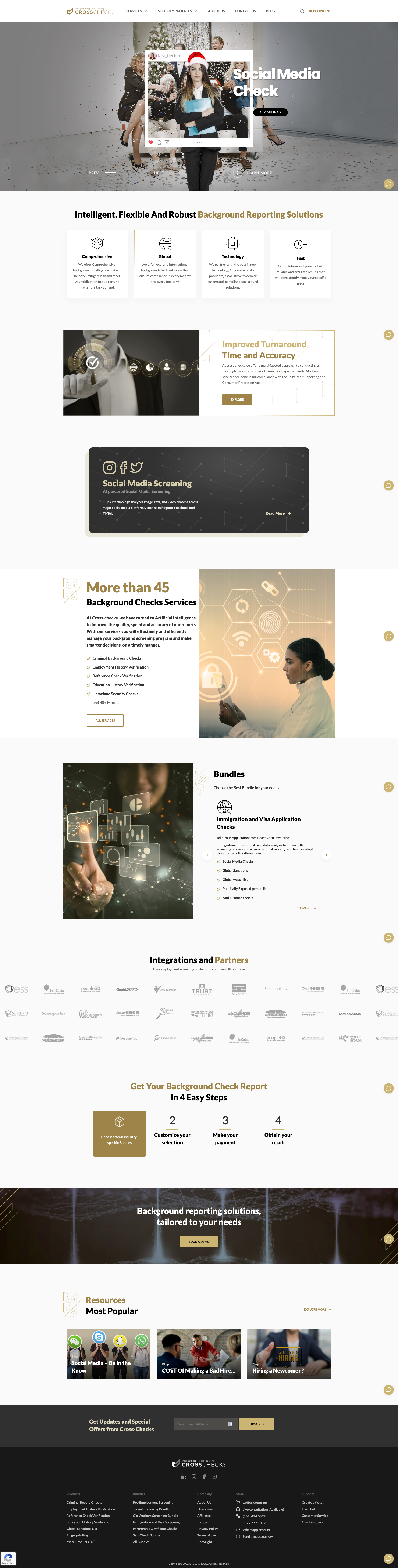
3. Redesigned homepage featuring service overview and concluding with testimonials to establish user trust for unfamiliar services
To ensure a more pleasant user experience, I've removed unnecessary distractions, such as animations and irrelevant information, which were found to be annoying during usability testing. Additionally, I created concise package service cards that allow users to quickly find and understand the most essential information without going to another page.
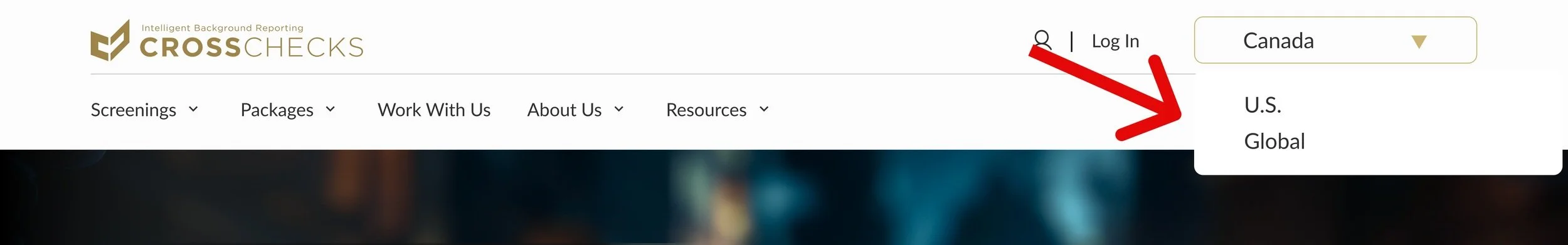
4. Added site-wide navigation for different countries
To ensure a more pleasant user experience, I've removed unnecessary distractions, such as animations and irrelevant information, which were found to be annoying during usability testing. Additionally, I created concise package service cards that allow users to quickly find and understand the most essential information without going to another page.

After
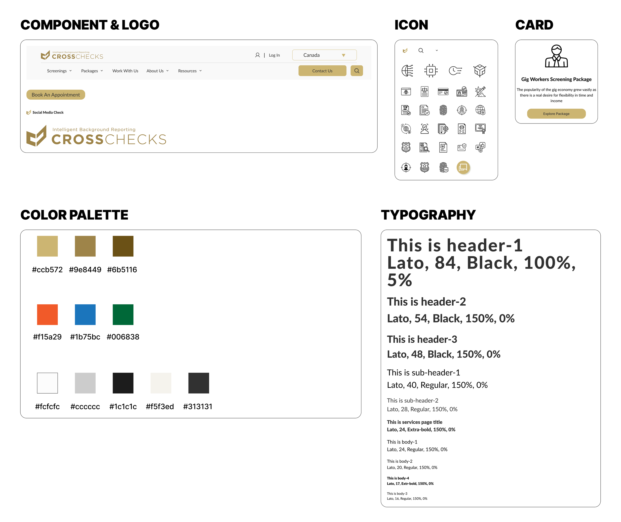
Built upon existing brand design by adding elements that refine content hierarchy and highlight CTAs
Maintain brand consistency and cater to user preferences, I preserved the original brand design elements.
Enhance content hierarchy and improve readability, I incorporated additional font sizes, weights, and neutral colors, ensuring a visually appealing and easily navigable experience.
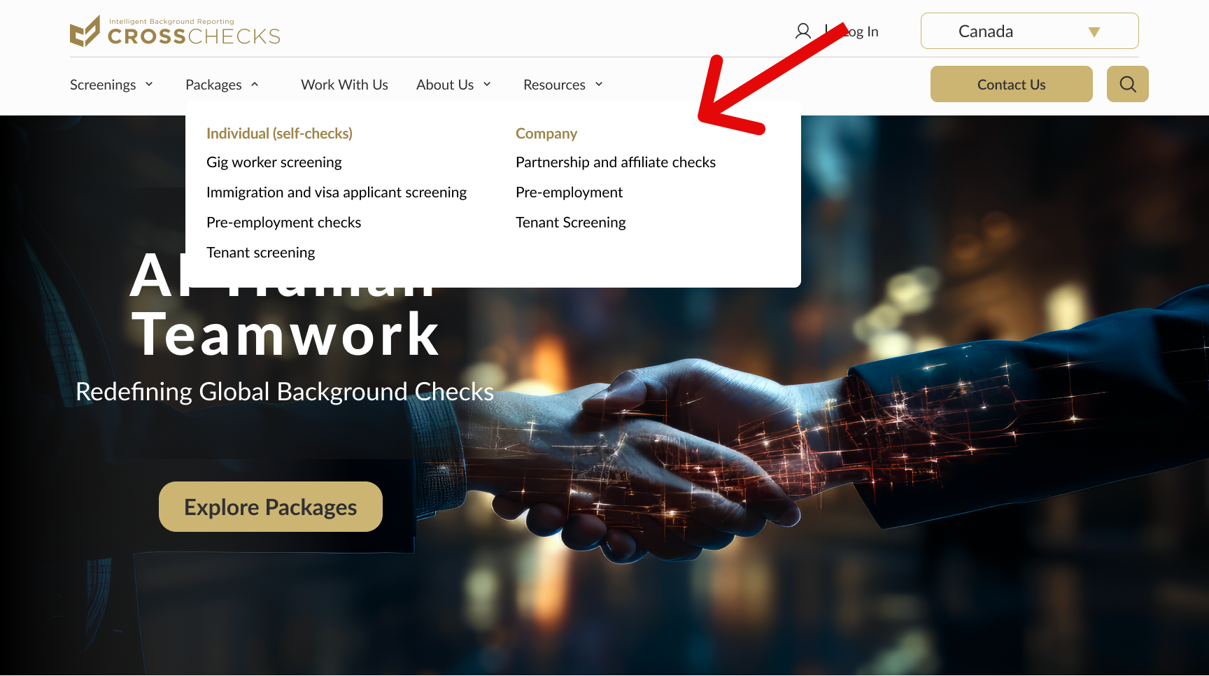
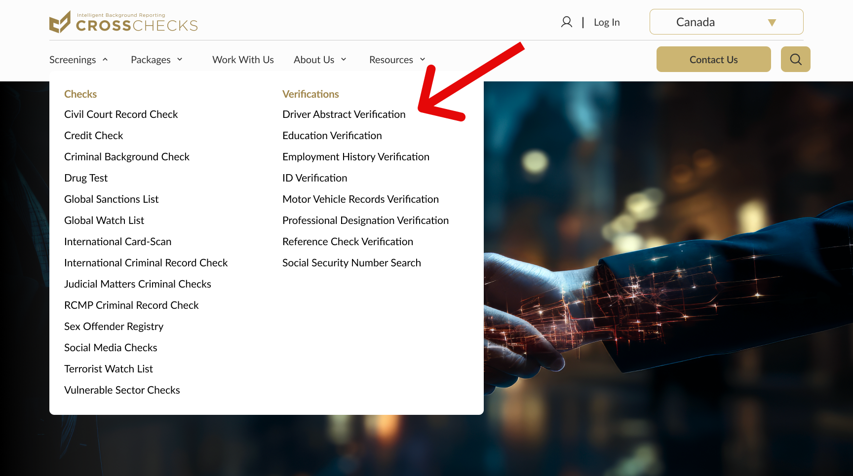
1. Introduced navigation dropdown for major services
To enhance user experience, I've introduced dropdown navigation, as users prefer this method for finding desired items. The dropdown menu is alphabetically organized and further categorized by relevant background check services. This user-centric layout improves accessibility, enabling users to efficiently locate the services they need for an overall streamlined experience.
Comparative User Evaluation: Original vs Redesigned Website
To assess the impact of the redesign, I conducted a comparative user evaluation involving five unique users. By measuring task completion times and gathering feedback on website design and navigation, I gauged the effectiveness of the implemented changes and identified any remaining areas for improvement.
100% user think it’s easier to navigate with a much more intuitive navigation, clear instructions, and a concise service overview
25% of the users think the new design still lack of enough information and a clear CTA
Prototype
Improvement and Reflection
1. Identify clients' unspoken needs, utilize AI and competitor analysis to comprehend the client’s industry standing and being proactive sooner. In future projects, I will be more proactively address potential unspoken needs and leverage AI-driven research and competitor analysis to better understand clients' industry standing earlyon.
2. Aspire to explore AI ethics and its integration into the background check industry, ensuring responsible and ethical use of AI technology. To better serve clients in the background check industry, I will focus on gaining a deeper understanding of AI ethics and its applications within this sector. By exploring ethical considerations and the potential uses of AI technology, I aim to develop tailored solutions that meet clients' needs while adhering to industry standards and leveraging the power of AI to enhance service quality and efficiency.
3. Clearer primary CTA and business model are in need. Balancing CROSS-CHECKS' global expansion with limited online information, identifying the primary CTA proved challenging due to a lack of service details. Competitors either offered clear CTAs for consultations or emphasized single service, while CROSS-CHECKS aimed for comprehensive solutions amidst growth and transition.
Post-launch UX metrics recommendation.
Task completion time and rate: Track task completion rates and times for key actions, such as plan purchases and specific information searches, to identify potential navigation or clarity issues affecting user success.
Bounce rate: Track the percentage of users who leave the site after viewing only one page, which could signal confusion or irrelevant content.
User satisfaction scores: Collect user feedback through surveys or questionnaires to gauge overall satisfaction with the website experience.
Conversion rate: Measure the percentage of users who complete a desired action, such as signing up for a plan or making a purchase.
The client expressed overwhelming satisfaction upon reviewing the proposal and delivered work
“Her thoughtful approach, asking the right questions, and doing deep research to truly understand my business, resulted in a website design that exceeded my expectations.“
UI Kit Design
Usability Test After Re-design
A mid-career HR in tech
Bolder CTA and hero session
Client Testimonial

Eliza M. CEO of CROSS-CHECKS

Moderated usability test in progress

Solution
By optimizing content hierarchy on the homepage and service pages, CROSS-CHECKS can provide intuitive navigation and clear instructions. These improvements will lead to a more user-friendly experience, making it easier for visitors to find relevant information and engage with the company's offerings.
Enhanced content hierarchy, providing intuitive navigation clues, and clear instructions to help users to find hidden services
Introduced intuitive navigation clues backup by researches with color, spacing, typography, and psychology
2 occasional background check users
3 naive background check users
1 from Canada

1 from UK
3 from U.S.


Before: no dropdowns
How do users behave and strategize during “drug test” navigation tasks?
How long does it take to finish assigned tasks?
What’s user feedback for the current site?
After: with dropdowns
Users rely on navigation menu for easy access to desired services and a better understanding of site functionality
Users typically give up after 180 sec, with an average task completion time of 103 sec.
Users felt overwhelmed by cluttered content, irrelevant information, and excessive animations
Audit and Usability Test
Hidden services and disorganized content resulted in a 20% user navigation task abandonment rate
Moderated tests with diverse participants confirmed audit findings, revealing that navigation challenges led to user frustration. While one user attempted to use the search function, its lack of prominence hindered others from discovering it, causing some participants to abandon their tasks. Measuring navigation completion times provided insights into necessary streamlining efforts.
Competitive Analysis
Conducted competitor analysis and AI research to identify effective website organizing strategies

Leveraging ChatGPT, pi, and client insights, I conducted a competitive analysis to identify key global background check companies. My goal was to understand their business structures, service offerings, and information organization strategies to inform CROSS-CHECKS' transition to a global provider.
To effectively design for a common service like background checks, it was essential to understand user needs despite CROSS-CHECKS' limited budget. By combine user interview and ChatGPT, I was able to create detailed personas which informed my design decisions.

How competitors and AI suggest organizing and structuring websites?
What kind of services do they offer?
After: Start with an overview and end with testimonials
Most of the global background check websites offer a whole site filter for country to ensure the accuracy of service
Competitors have testimonial section to increase users’ trust
Lack of transparency and disorganized content are some common problems within background check industry
Who are our users?
A small coffee shop owner
Re-design Updates

Before: loads of texts with carousel animation
Before: Clutter design with excessive animations and no information hierarchy
Before


Services process overview
Screening services overview
Package services overview
Testimonials